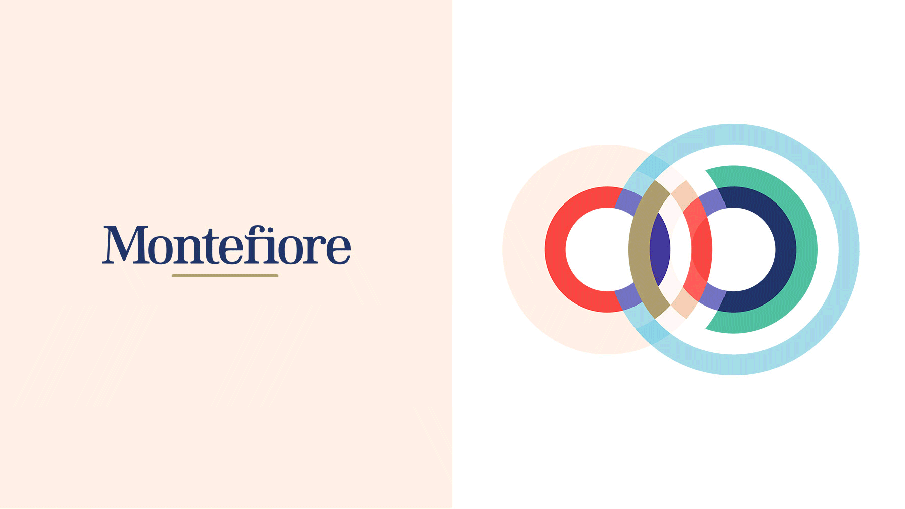
Montefiore logo and visual identity
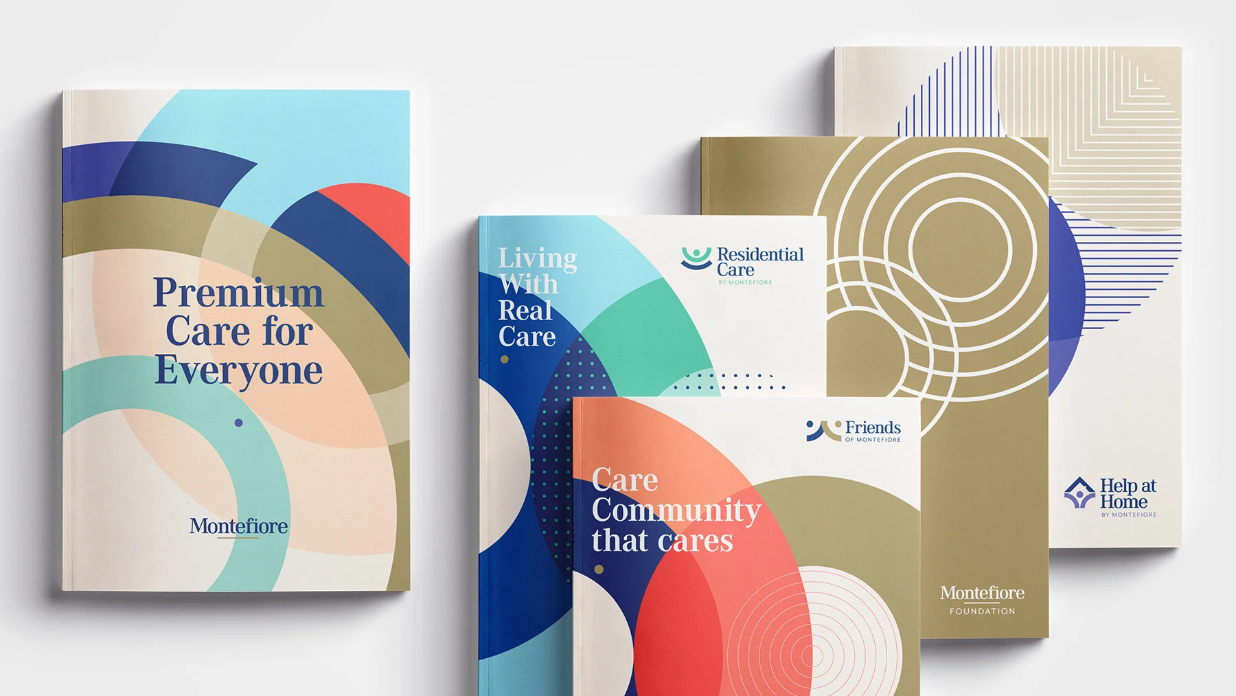
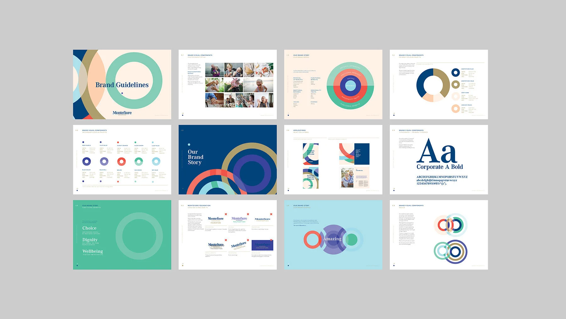
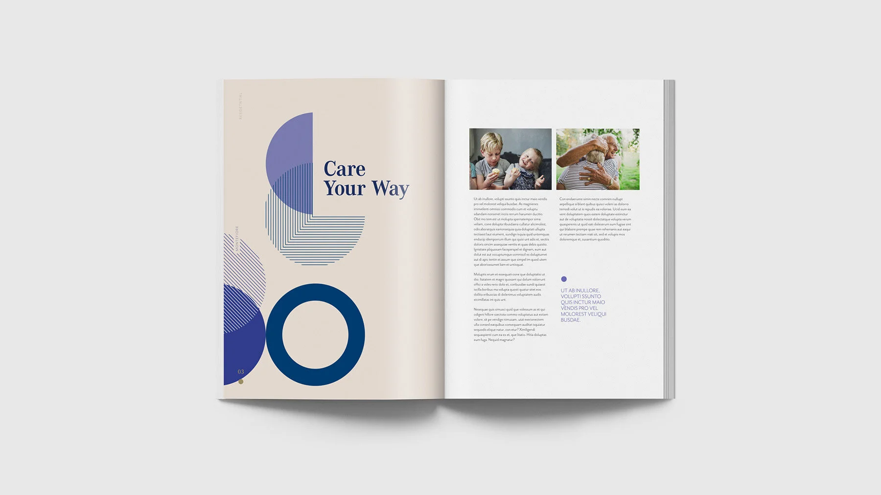
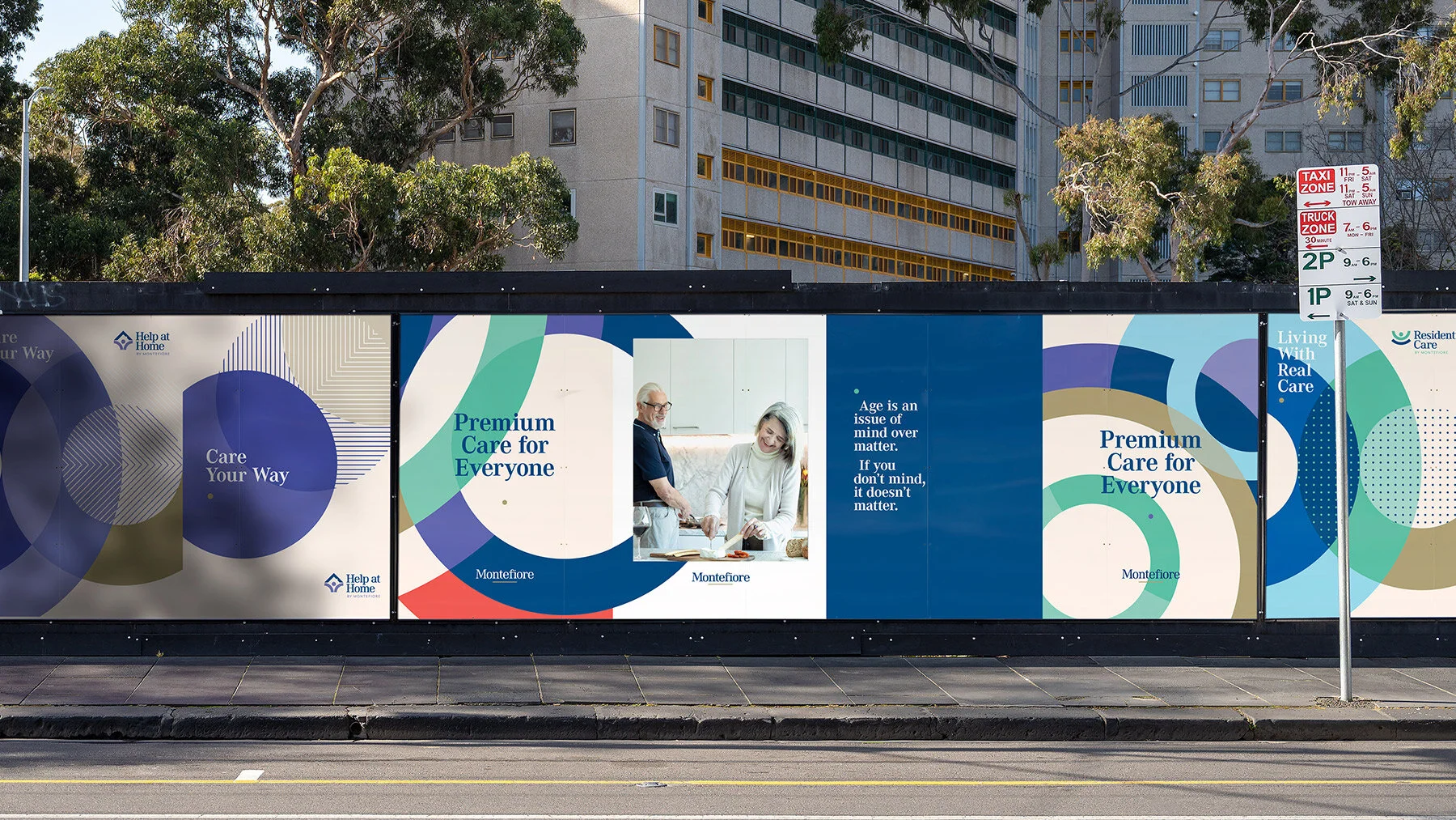
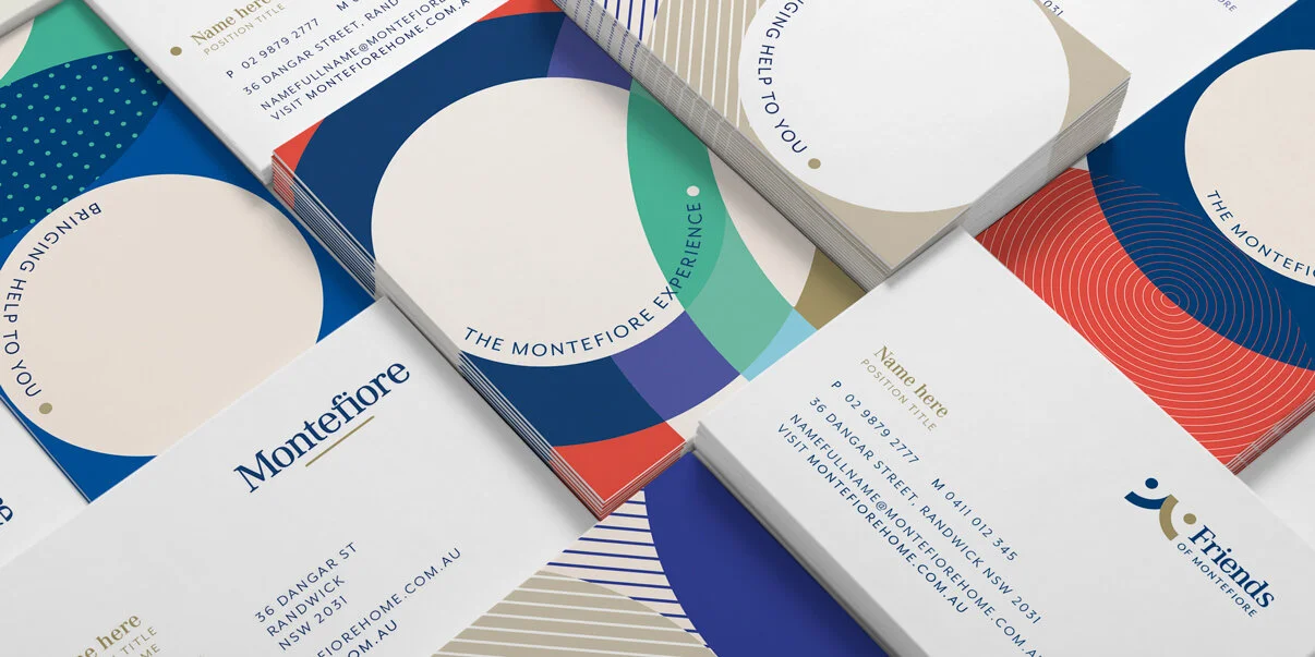
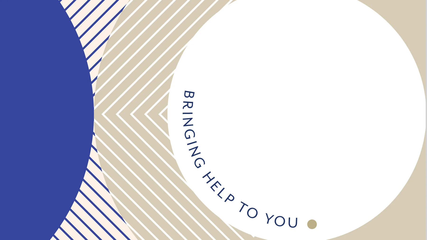
Montefiore puts the focus on creating homes, not institutions. Offering residential living, help at home, and luxury independent living along with, foundation and partnership work. The visual identity takes inspiration from tree growth rings that represent aging –and life. Concentric circles that depict vibrancy and energy, as though it ripples outwards which also speaks to their breadth of service – that they are inclusive and welcoming. Circles are a strong symbol of unity and community– it’s about wellness and wholeness.
Designed at uberbrand / Role : Lead designer, concept development roll out and website.